
Optimizing the Bloomingdale’s Mobile Shopping Experience

industry
e-commerce
product medium
native mobile app (iOS & Android) and web-based e-commerce platform
my role
e2e product design
my task
As a Product Designer, I was tasked with exploring new improvements to enhance the Bloomingdale’s mobile shopping experience.
This was an exploratory project focused on identifying key pain points in product discovery, navigation, and checkout—ultimately aiming to make the shopping journey smoother, more engaging, and conversion-friendly.
This process involved user research, wireframing, UI design, and interaction improvements, ensuring that proposed enhancements aligned with both user needs and business objectives.

introduction
Bloomingdale’s is a leader in luxury retail, but its mobile shopping experience had gaps in usability. Customers found it challenging to browse, compare products, and complete purchases efficiently.
the challenge
How might we improve product discovery and checkout to create a seamless, high-converting mobile shopping experience?


Understanding the Problem
I conducted usability testing with 5 users, applying Jakob Nielsen’s usability heuristics to identify friction points.
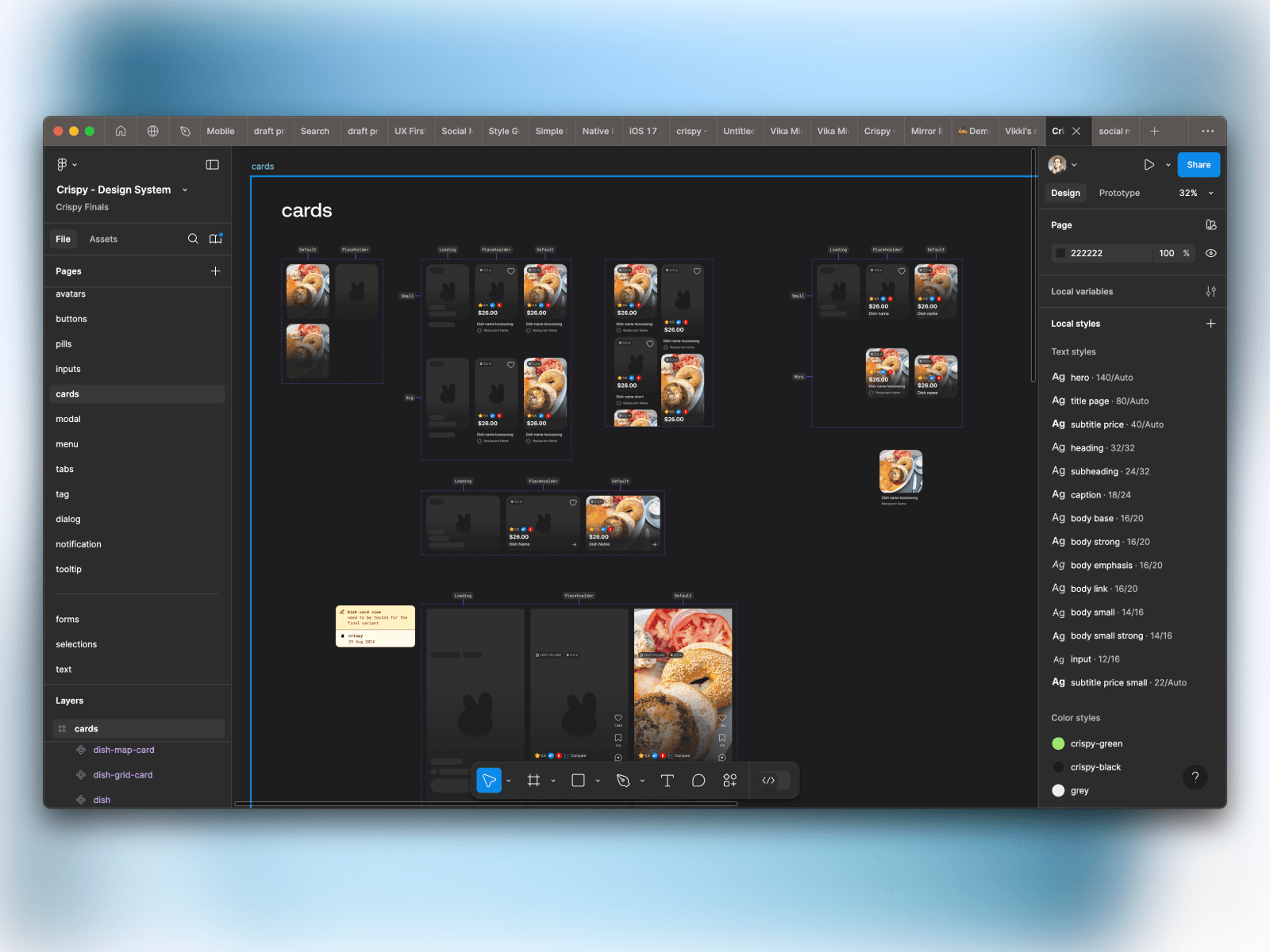
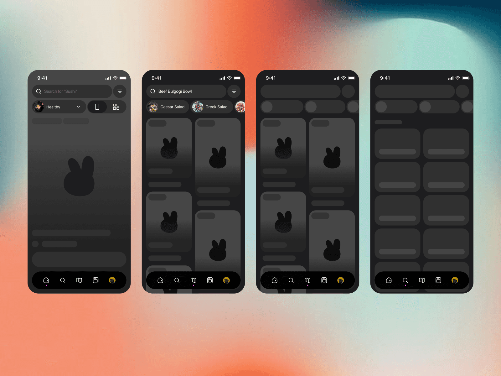
Screenshots to Include:
✔️ User journey map highlighting pain points.
✔️ Wireframes showcasing navigation and checkout improvements.
for sure
We know how important it is to put ourselves in our user's shoes, when making design decisions.

how I work
I am always trying to find unique aproach but the approach that will alighn with buisness goals and will help to grow.


my approach
Product design should be built upon research and facts, not assumptions.
